It can be easy to assume that tech fashion never changes – that it’s just an endless succession of sleek silver boxes and crisp minimal user interfaces. Naturally, on some level this is true as these qualities have come to be associated with premium, high tech products for decades.
But within this overarching aesthetic, we find that – as with all things – there are fashions, trends, and a design language that evolves and responds to what came before it.
If we turn back the clock 20 years and look at the dominant tech design language of the time, it may surprise those of us who have fond nostalgic memories for everything from the Nintendo Wii home menu, to Windows XP. What may, in our minds’ eye, be remembered for sleek design, rich colours and forward-thinking interfaces, turn out to be something frankly bizarre.
This design period has come to be known as Frutiger Aero, and it still retains many fans on the remote reaches of the internet. It was defined by bubbles, aquatic imagery, nature scenes, bright colours, and highly shiny, polished surfaces.
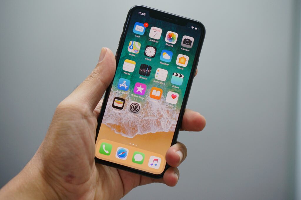
If the next iOS version were to drop with this aesthetic today, it would look horribly out of date, clunky, and overwrought. In fact, even in the past 10 years we’ve witnessed a shift in design language – away from the pristine minimalism of the 2010s and towards a more playful and colourful language, albeit one that is still dominant by crisp, stylised icons and flat menus.
Another throwback to the 2000s that appears to have done the way of the dodo, at least temporarily, is skeuomorphism. When Jony Ives pushed through iOS 7 back in 2013 it was considered by many to be the death knell in this particular design language. Suddenly realistic shapes, drop shadows and nostalgic design nods were out, and flattened highly simplified icons and menus were in.
Mimicry in Design
But skeuomorphism is more than just a trend, it’s an ingenious design idea, and one that rears its head still in more places than you may imagine. A simple definition of skeuomorphism is that it’s a way of making something resemble something else.
In the tech world, that normally means getting a digital object to resemble its physical counterpart. We’re so used to this idea we hardly notice it. Consider the trash can or recycle bin on your desktop – there’s no real reason why this folder needs to resemble a physical bin, and yet it does.

Even the notion that underpins the design language of the Windows operating system derives its core idea from skeuomorphism. Before Windows, people were unfamiliar with graphical user interfaces on computers, or how they could be used. By conveying that different processes could be rendered as distinct panes you look through – like real windows – Microsoft was able to quickly and efficiently convey its intentions.
Playful Anachronisms
In some areas, skeuomorphism holds out better than others. Consider the world of online slots titles. These games draw on a rich history dating back to the first mechanical fruit machines in the 19th century – though today, they’re purely software based.
Yet in spite of this, online slots retain the sounds, mechanics and even the familiar pull-lever known as the one-armed-bandit in many cases, as a way of effortlessly conveying how to interact with them, perhaps to those familiar with physical examples but new to their digital successors.
Skeuomorphism raises its head wherever there’s an issue of literacy to be addressed, essentially. This is why it’s gone out of fashion on smartphones right now. We all know how they work, what apps are, and how we navigate through iOS and Android. As such, the need for loud design cues drawn from the real world to assist in this process has become somewhat redundant.
Will Skeuomorphism Be Back?
One could counter this with the question of whether it ever went away – but whether skeuomorphism will make its return to devices around us in quite the same way is harder to gauge. Undoubtedly the pendulum in mobile design will swing back towards a more maximalist approach, but this needn’t result in drop shadows or dials making a reappearance.
Perhaps if we want to look for a revival in skeuomorphism we need to look to new technology that comes with lower literacy. For example, it’s easy to imagine skeuomorphism design ideas rearing their head once again in the future interfaces of VR headsets like Apple’s soon-to-launch Vision Pro.


